Case study — measurement & governance
Experience Measurement
I built the discipline before the organization asked for the dashboard.
- The problem
- 100+ applications, no experience measurement at all — what measurement existed was engineering’s (DORA, APIs, resiliency), and even that wasn’t universal; nobody could see the associate.
- What I did
- Established a product operating discipline inside the UX organization — instrumentation, HEART, task success, sentiment, product outcomes, and post-launch accountability — then scaled it into portfolio reporting, governance, behavioral observability, and App → Journey → Task measurement.
- What shipped
- A manager-era measurement operating model; recurring store leadership reporting; a common UMUX-Lite standard; multi-app portfolio reporting; a governed Pendo rollout; and journey measurement implemented across priority experiences (the Journey Management use case).
Listen & read this case study
Opening
- 1×
- 1.25×
- 1.5×
- 2×
- 2.5×
- 3×
Loading audio
I did not start this work because senior leaders suddenly asked for an experience score.
I had been pushing for measurable product quality for years. When I moved into store UX management, getting even basic behavioral analytics into associate software was a major lift. I pushed for Google Analytics instrumentation, taught my team to use the HEART framework, and deliberately trained UX practitioners to think in the same analytical language as the products they were helping build: outcomes, signals, task success, and operating performance — not just screens and research findings.
My team sat in UX, but I was not building a design-service operating model. I expected the team to understand the product strategy, business and operational outcomes, behavioral data, success criteria, and what happened after release. Research and design craft mattered; they were part of a larger product system.
By 2021, that philosophy had become an explicit team operating model, written down: I required balance teams to define OKRs, HEART metrics, and production delivery together, with Happiness and Task Success as the two required HEART dimensions. And I set two domain targets — targets, not realized outcomes:
Nobody asked me for any of it. I saw the pain, made the case, and got my team aligned behind a discipline no one yet owned. That was the origin: one team’s operating model, which grew into the store portfolio strategy — and became one of the seeds of the enterprise experience operating model that followed.
Build the analytical muscle before building the reporting system
The first problem was more basic than inconsistent dashboards: we did not have enough trustworthy product evidence to reason from.
The baseline was not inconsistent measurement. It was none. What measurement existed belonged to engineering — DORA and its surroundings: deployment frequency, lead time, change failure rate, time to restore, plus API performance and resiliency — and even that did not cover every application. Where it existed, it was real and useful, and it measured how well the software was delivered — not whether it worked for the associate using it. Across a portfolio of well over a hundred applications, some had pipeline telemetry, some had nothing, and none had experience measurement.
So, this meant that if outcome definition was going to happen, someone had to start it. It started with us — my team first, then in collaboration with the product managers themselves, defining balanced-team OKRs together and connecting them to the objectives and measures our executives were already steering by.
I was establishing a product operating discipline inside the UX organization. My team needed to connect research and design work to product strategy, balanced-team goals, behavioral evidence, success measures, and post-launch performance. I introduced HEART as a practical operating framework rather than a research artifact. We focused on Happiness and Task Success, expected teams to define success alongside balanced-team OKRs, and established recurring measurement rather than one-off usability studies.
I set a cadence to go with it — HEART happiness and task success month over month, a sentiment snapshot each quarter, collected the same way across the domain. What scaled it from there was not a mandate — it was momentum. The team showed results, the results built credibility, and buy-in compounded layer by layer: individual contributors, managers, senior managers, directors, VPs, and the product and business partners we worked with. None of the scale that came later happens without that buy-in.
The goal was intentionally two-sided. If a redesigned workflow made an associate faster but also made the job more frustrating, I did not consider that a clean win. If satisfaction improved while task performance deteriorated, that was not enough either.
The intent was never sentiment for its own sake. I was building the measurement needed to understand whether the software helped associates perform, and how that performance connected to the operational and customer outcomes the business cared about. An associate who can’t find inventory, or whose work is poorly prioritized, isn’t a usability statistic. That’s search time, unfinished recovery, product that isn’t on the shelf, and a customer who doesn’t find what they came for.
The important leadership move was changing the team’s default posture from “we designed the experience” to “we understand the product outcome, we know what success means, and we should be able to show what changed after release.”
Turn a local discipline into a Store standard
Turning one team’s discipline into a portfolio practice needed an on-ramp every team could actually take.
My own team was running the full HEART framework, and pitching that across every UX team in the portfolio would have been too heavy a first ask — a read my experience director and I aligned on early. So I led with UMUX-Lite instead: two questions, light enough for any team to adopt. I called it a Trojan horse at the time, and that was the design — an easy first step carrying the whole experiential-measurement ambition inside it. The pitch walked the stepping path deliberately: the HEART and analytics work already done, funnel metrics already running on a couple of applications, and where it could go next — the class of product-analytics platforms that would eventually give us real behavioral observability. The near-term ask stayed modest on purpose: get every UXer in the store portfolio comfortable asking the same two questions.
It worked — and the success created the next problem. As adoption spread, teams implemented the standard slightly differently: different wording, different prompt timing, different rating scales, raw data exported and analyzed team by team. Every one of those choices is defensible alone. Together they gave the portfolio a hundred dialects and no language. I built through it rather than waiting for perfect — custom dashboards and data automations kept portfolio visibility live while the operational mess got cleaned up.
So I made the call to standardize the signal before treating it as portfolio accountability, and to be specific about what that meant: the two questions locked word for word, everyone onto a five-point scale by a dated deadline, prompting reduced to two sanctioned patterns — in the flow of the task, preferred, or out of context with an added framing clause — and the scoring itself centralized. Teams kept doing their own analysis — digging into their submissions, chasing problem areas, attributing causes inside their balanced-team spaces; that is exactly where that work belongs. What ended was private score math: teams had been inventing their own formulas, and the numbers didn’t match. One rubric, one scoring model, everyone’s data flowing through the same dashboard.
No one should be doing their own private score math; all data related to this metric should be the same.Measurement communication plan, internal (condensed)
The scaling mechanism mattered as much as the standard, because I was not going to become the human API for a hundred-plus applications. The portfolio strategy was mine; what I distributed was the execution. The plan made senior managers responsible for training their people and managers accountable for their teams carrying it out, written into a RACI so nobody had to guess. They were not co-authors of the standard — they each owned a slice of the portfolio and the people in it.
The coverage numbers set the scale: 100+ applications across the portfolios, 45 of them in the store portfolio, and adoption of the standard moving from 6 to 11 to 32 by January 2026 — by the end, more than 70% of the store portfolio was covered.
A portfolio score is a health signal, not a diagnosis
One high-volume order-management application proved the point. Across 3,553 submissions: an average ease-of-use score of 2.87, a “meets my needs” score of 2.54, and 37.5% negative sentiment against 27.2% neutral and 35.3% positive.
Those numbers were specific. They still were not a roadmap. What made them actionable was the breakdown underneath: one theme, order-management issues, accounted for 2,187 categorized responses — 62.3% — while the six remaining categories combined came to under a tenth of the set.
The team was under pressure from both directions: associates were complaining while business and product partners were demanding delivery. Instrumentation could look like overhead. I worked with product leaders, UX researchers, UX leadership, and balanced teams to connect experience signals to consequences those teams were already accountable for — customer complaints, order-handling failures, markdowns, and friction in large-order workflows — then define what evidence would actually distinguish the causes. Without observability, the team could spend more and still fix the wrong layer.
That segmentation is also how the system closed its first full loop. A recurring complaint about logout and session behavior could be isolated as its own theme and trended month over month instead of sitting inside an average. I brought that trace into the leadership conversation and helped frame what would count as evidence. The owning product and technical teams took it from there — traced the visible symptom across a system boundary, shipped a lower-cost mitigation, and isolated a deeper credential and integration problem that belonged to another team. Afterward, self-reported logout complaints dropped sharply.
The same segmentation caught a different class of complaint. Associates moving off the legacy system had years of accumulated workarounds that the newer product deliberately closed, because some of them routed around a policy rather than a bug. That feedback arrives sounding like a missing-feature request — I used to be able to do this — and the right intervention was often not to restore the workaround. It was to explain the rule in the flow and help the associate handle the customer conversation it created.
That is what the system was for: signal → segmentation → diagnosis → accountable owner → proportionate intervention → validation.
Executive demand was an inflection point, not the origin story
By mid-2025 I was presenting the monthly readout to cross-functional VPs and directors — communication material built for alignment and visibility. That visibility is exactly why it traveled, and it traveled one level further than it was built for: to our CEO, Ted Decker. What reached him was still the on-ramp metric — two-question survey scores, not the mature experience measurement we were building toward — with none of the context attached. He did what almost any executive would do with two product scores side by side: asked why one was worse than the other, and began reasoning toward a decision on a number that wasn’t built to carry one.
The cleanup was mine to lead. I re-engaged the leadership chain, got alignment on what the metric was — and wasn’t — built to say, and made the fix structural rather than situational.
Methodology now traveled attached to the number: the portfolio was mid-migration between two collection platforms, and scores from the old instrument and the new one are not the same measurement, so every report labeled its source. Trend replaced the single-month snapshot. And the executive-facing readout became its own designed object, built for that altitude, instead of the working file forwarded upward.
Change the unit of analysis from the app to the work
Fixing how the number traveled solved the altitude problem. It did not touch the deeper limit: even a well-governed app score has a structural ceiling. Associates do not experience the organization one application at a time. They start a piece of work in one tool, cross into another, hit an authentication or policy dependency in a third, and finish somewhere else (the Common Associate Store Experience use case).
An app-level average blends every workflow inside the product:
These averages hide crucial details.Experience metrics strategy, internal
So I made the architectural call to move the model from application to App → Journey → Task → Event (the Journey Management use case; the Unified Tasking use case), and to make it governed: canonical naming for every app, journey and task; journeys mapped to their tasks in one source-of-truth matrix; URL patterns and segment rules defining who and where gets counted; a validation plan; a decision log; and a RACI naming who approves a tag before it reaches production. Every task belongs to exactly one journey; every journey rolls up to exactly one application container; no duplicate tags across apps.
The second half of the change was the signal itself: pair perception — what the associate reported — with behavior — completion, drop-off, path, time on task. What an associate says, plus what they actually did. You need both to argue for a fix and then to prove it worked.
Moving the unit of analysis is also what let experience signals sit next to the operational measures our product and business partners already owned — task actionability, search + recovery effectiveness, and on-shelf availability. That last one is one of the most direct links between store execution and whether a customer finds what they came for — and I made that argument at the time:
From the customer’s perspective, if the expected product isn’t in the location they were expecting it to be — we’re out of stock. It’s that painfully simple.Store Operations All Hands, internal
The industry has long put real money on that simplicity. The long-running out-of-stock research published in Harvard Business Review found retailers lose roughly 4% of sales to stock-outs — and that roughly 72% of stock-outs trace to in-store execution rather than supply — and major retailers still tell investors the same story today; Target’s 2026 earnings calls named in-stock availability the single biggest friction point for its guests. Our own internal modeling was consistent with that research — which is exactly why I was feverish about connecting associate task performance to availability. Once that connection exists, “the software is hard to use” stops being a UX complaint. It becomes a business signal with an owner.
Build the reporting system as a product, not a monthly deck
All of that signal needed a place to land. The infrastructure evolved in stages.
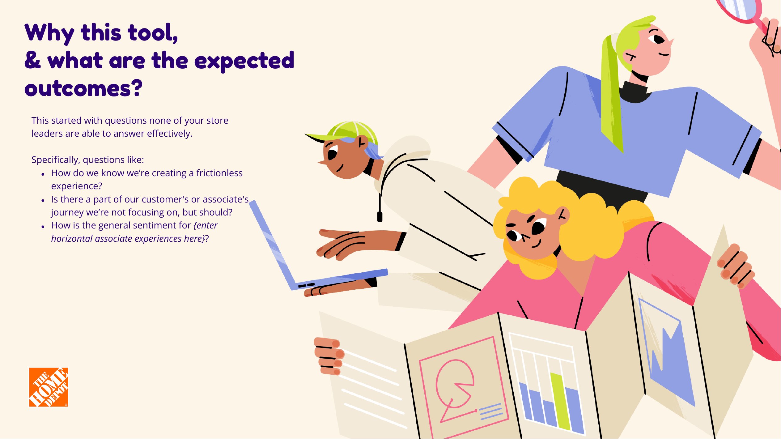
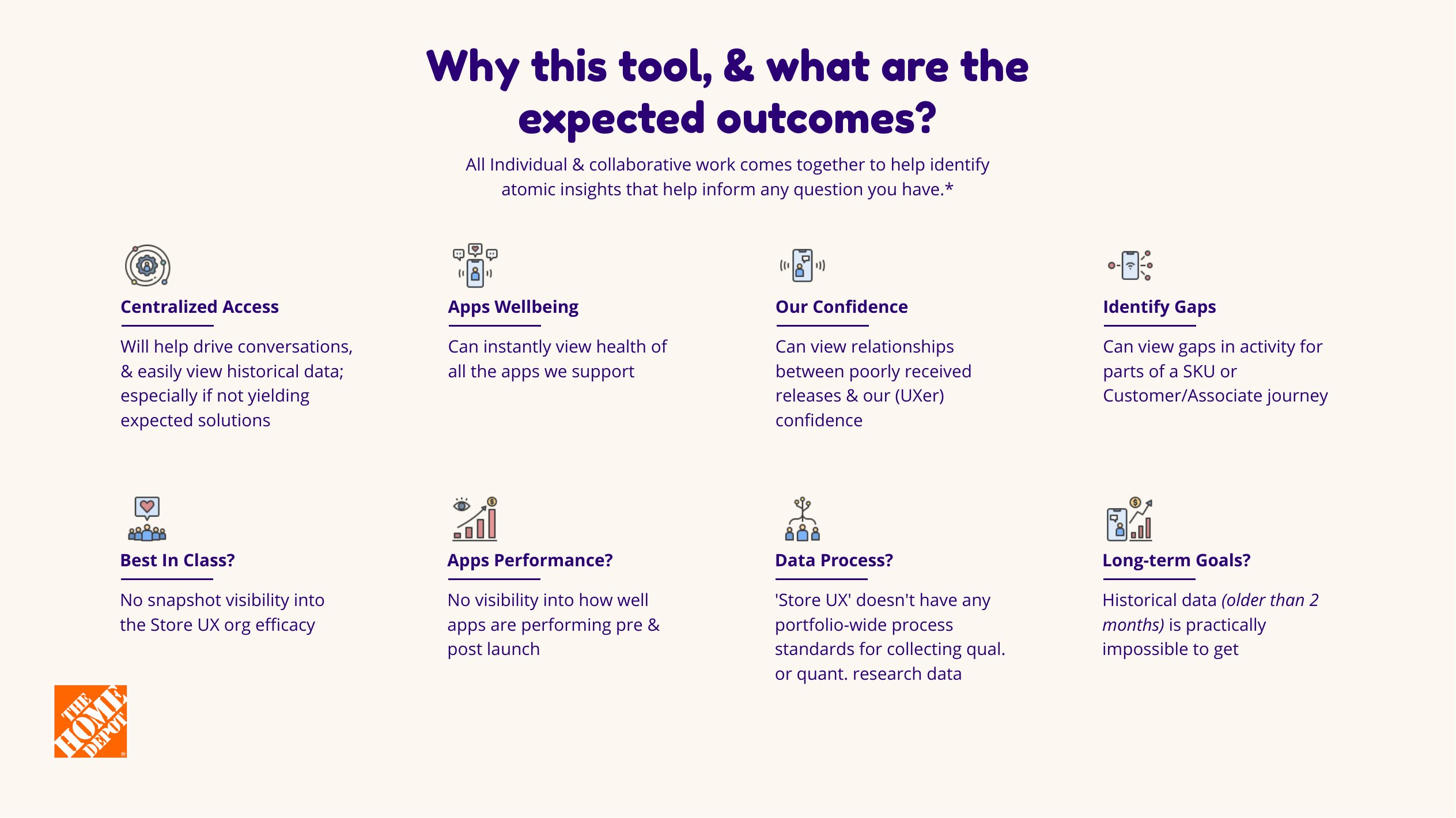
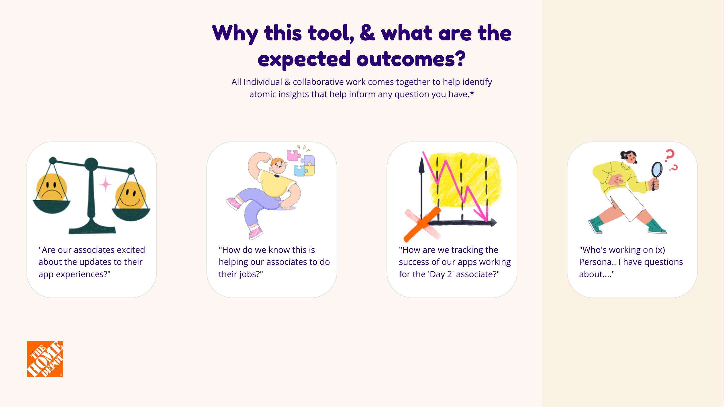
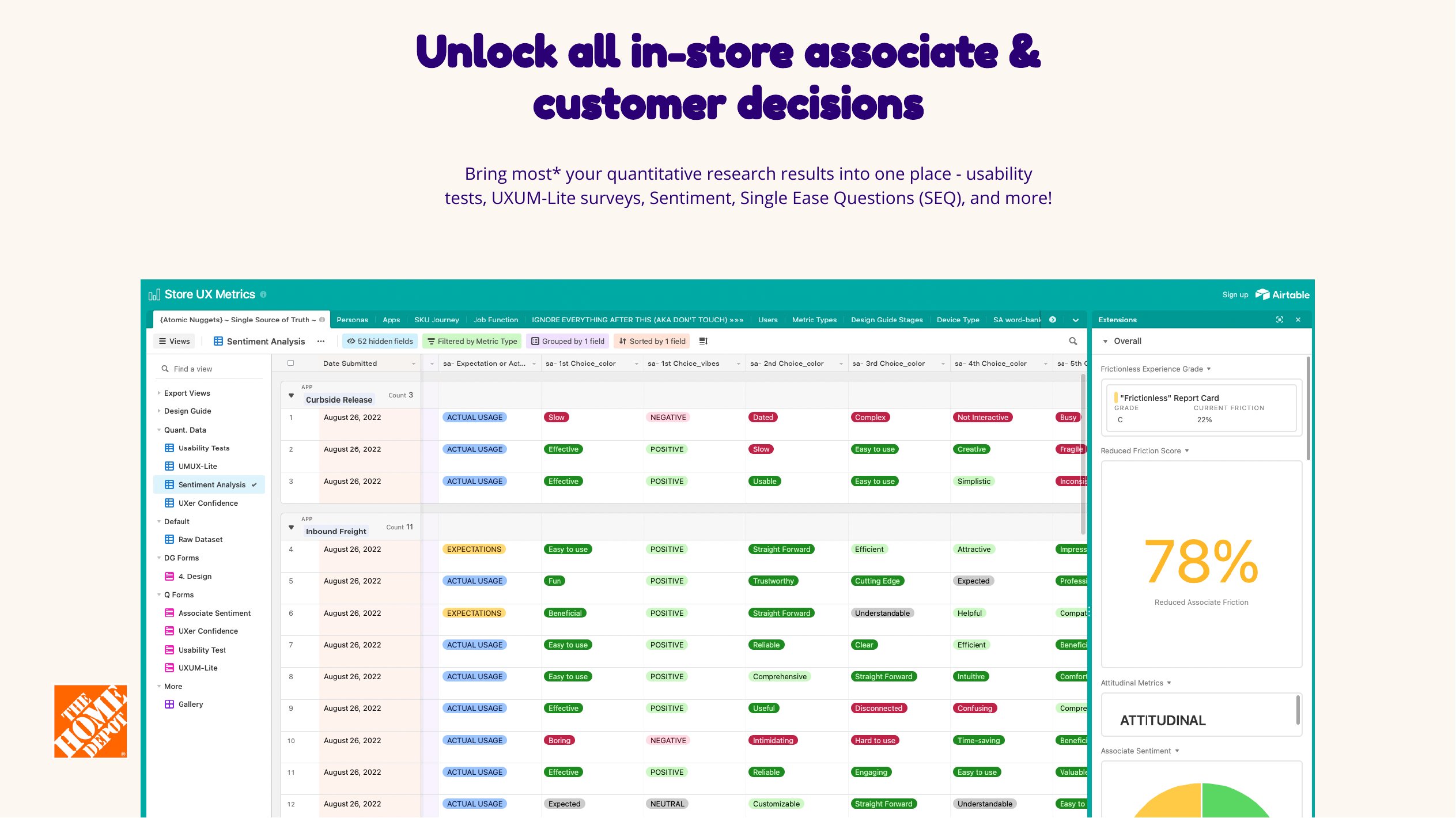
In 2022, in a fully remote year, I opened the first centralized version as a Miro walkthrough. This was not a pitch. Store Operations UX leaders and a small beta of practitioners already knew the work. The board was the invitation to everyone else on that side of the house — how to use the system, how to put research in so it stayed visible to the portfolio and to leadership, how to get answers out — and, by the access I set up, anyone who could reach the Miro board and the Airtable behind it.
That was a continuation of the same job I had been doing with my own team: building a data-minded practice. As I moved into the senior principal role, not everyone in Store Operations UX had that fluency yet. The recordings were not just Airtable UI. Interacting with Data and the answering-a-question example were about the mindset — what to ask, what partners ask, how to navigate for an answer, and what to do when the answer is not in the system yet.


Airtable was the first working model, and it was not a metrics dashboard. It was a research repository with an attribution model — and experience metrics lived in the same base. That combination was the point. The enterprise UX team had already bought EnjoyHQ as the research home; in practice it was unstructured blob text, no shared template, almost no way to find a study. Miro boards had the same discoverability problem, scattered across the org. OneDrive did too. Airtable was the bridge: one place to put the work, and one place to find it, without throwing the originals away.
People logged usability-test results — that is how time-on-task entered the system — plus metrics, raw files, journey maps, prototypes. I asked for a format; I also wrote the scripting to pull what I needed when the upload was messy: sentiment, UX metrics, UMUX-Lite, raw research, observability, artifacts. If the original lived in Miro, EnjoyHQ, or OneDrive, Airtable linked back to it. Search followed the language in someone’s head — a journey, a channel, order fulfillment, a journey map. If the artifact was not there, you could still see who owned the domain and when it was last updated.
The board had the recordings. The walkthrough that sat with them is this.
The repository job and the metrics job later had to split. The repository and the attribution model stayed in Airtable. Experience metrics outgrew the paid base we were on — 100,000 rows, against years of history, tens of applications reporting every month, and high-volume apps producing thousands of responses in a window. Metrics moved into a dedicated Excel model with custom dashboard scripting. The reporting system below is that second track. Airtable kept running in the background as the research system.
The Excel model started as survey exports loaded by hand into a spreadsheet query layer — one application, three-month window. From there: a source switch when the second collection platform arrived, validation messaging so a user could see which source was live, loading logic that adapts to either platform’s column structure and any number of months present, then multi-application support, an application → domain → portfolio hierarchy, weekly views, quarterly rollups, and a detailed all-applications overview.
That Excel model was not a shared working surface either. It lived on OneDrive. The weight of it was the point and the limit: it kept people from breaking the numbers, and it also meant I was the one living in it. I moved off it.
All of that shipped. Domain and journey views, behavioral pass/fail and time-on-task structures, a composite score, and persona segmentation were already in the product. What was still moving was coverage — more experiences instrumented, more applications putting observability in — and polish on the pieces I used with partners and leadership. In parallel I built the web data product that became the last stage of this track: database from zero, schema, backend, data model, frontend. The model and structure were mine; AI is how I built them into a running application. What is real is the structure: top pains and their call-outs, affected applications, the relationship model between them, top feedback themes — pulled from exports I already had a model for, then coded into this experience. Export replaced the decks I had been making by hand. I reported from this for a long time. People knew it existed. I screen-shared it in the room. I modeled the work on it. The UX director had a login. I did not provision logins across the org. The remaining job was less the dashboard and more getting teams to implement observability in their applications. The screenshots below use fake data on purpose.


AI came in late, and I kept it away from the math
Most of this strategy predates my use of generative AI in the work. By 2025 the volume of open-ended feedback made manual theme synthesis the bottleneck. And the naive fix fails in a specific way: run three thousand comments through a chat session and it returns different themes every time — plausible on every run, repeatable on none. That is unusable as decision infrastructure.
So I engineered it like any system that has to produce the same answer twice. I built a versioned library of purpose-built prompts — theme extraction, score drivers, sentiment breakdowns, quarterly summaries — each one a staged pipeline with gates: a structure check on the data before anything runs; exclusion and dedup rules for blank, emoji-only, and generic responses, with the excluded share reported out; associate-selected classifiers treated as primary evidence before any text analysis; a support threshold, so nothing counted as a theme without at least ten unique comments behind it; a hard rule against unsupported solutioning; percentages reconciled to 100% of meaningful unique comments; and a confirmation gate before anything became a report. The evals were the point: the same dataset had to return the same themes run after run, and with the structure in place it did — over 90% consistency, with little to no hallucination.
I tried it on the quantitative analysis and stopped; it wasn’t reliable enough. Scores never went through a chat session. They stayed in deterministic logic I could check — spreadsheet first, then Postgres views that aggregate on the server. Pendo and Medallia feeds landed in that model. AI is how I built the web product around it: the data model and structure, a React front end that started from a Figma export of the design file, the wiring. It helped me stand the application up. It did not crunch the data. I keep those provenances separate on purpose: AI supported synthesis and implementation late in the program; it did not originate the strategy, and it was never the source of a number.
What shipped, what was still moving
Where the program stood when I left:
- ✓A locked two-question standard, one scale, one central analysis pathshipped
- ✓A recurring portfolio readout replacing isolated team scorecardsshipped
- ✓Portfolio-level instrumentation governance, with me as portfolio ownershipped
- ✓Journey measurement live in two priority experiencesshipped
- ·Journey measurement in a third, mid-redesignpartial
- ✓Multi-app, multi-view reporting with portfolio rollupsshipped
- ·Behavioral metrics wired through to journey reportingbuilt · coverage widening
- ✓Journey-aware web data productin use · limited login
The journey and behavior views in the product were already there. What was still moving was coverage: more experiences instrumented, more applications putting observability in, so those views had enough real signal. I polished the pieces I used with partners and with leadership. Login stayed limited. People already knew the product because I presented from it.
The outcome I’d defend is organizational rather than numerical. By the end, a product leader in that portfolio could ask four questions and get answers: where to look, what kind of problem this is, who needs to act, and whether the signal moved afterward. None of those were answerable when I started.
Underneath all four is what the system was built for: experience measurement made associate experience health observable alongside the operational and business measures, so teams could connect software friction and task performance to the outcomes their product and business partners were accountable for.
What I’d do differently
Scale the interpretation at the same rate as the reporting
I built distribution faster than I built the ability to read what was being distributed. The monthly readout was designed for a room I was in — VPs and directors who got the context live — and I let the same file travel beyond that room unchanged, because traveling was the goal. If I ran this again, the executive-facing object would be a separate designed artifact from day one — fewer numbers, the methodology visible on the face of it, and trend rather than snapshot — shipped in the same release as the working view rather than assembled under pressure after a number had already landed somewhere it couldn’t be explained.
What this work proves
I did not begin this work with an executive mandate or a polished measurement platform. I began with a management belief: a team responsible for product experience should be able to prove what changed.
That started with basic analytics, HEART, task success, and associate sentiment inside my own team. It matured into common store standards, executive reporting, observability, journey architecture, governance, and a measurement data product — and became a reference point other groups were asked to standardize toward.
The hardest lesson came from success rather than failure: a measurement system only becomes dangerous once people believe it.
Executive visibility gave the work urgency. Better instrumentation gave it a better signal. Journey measurement gave it better resolution. The through-line stayed the same from day one: make product quality measurable enough to learn from, accountable enough to act on, and trustworthy enough to guide decisions.